Encolpius
Silver Level Poster
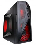
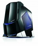
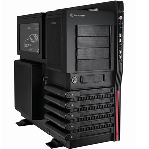
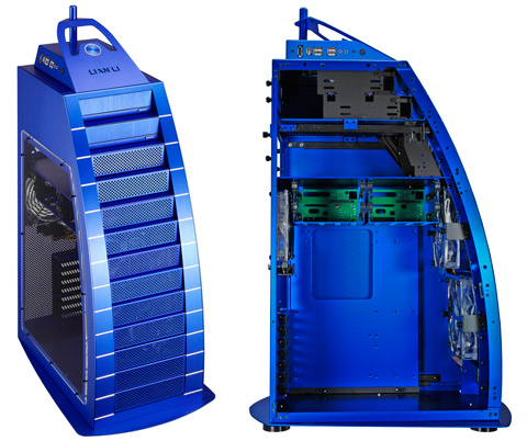
PC cases nowadays, especially the so-called "gaming" cases, are BUTT UGLY.
Seriously.
What with being way too wide, LED fans (why oh why oh why), front plates that look like tank treads, belt-hitching names, and other tacticool nonsense. What's wrong with "less is more" and all that. Sorry, but whenever I see an LED-encrusted box I immediately think of those asbonauts who used to charge around the godawful provincial town I previously called home with barried-up hatchbacks with plastic body kits from Halfords.
What, in people here's view, are the ugliest cases they've ever had the misfortune to encounter.
Here's a particularly unpleasant specimen. It looks like an evil robotic vajayjay.
